
How to Pair Patterned Curtains with Decorative Ceramics
To pair patterned curtains with decorative ceramics, choose one shared color, vary the size of the motifs, and give each piece enough plain space to be seen clearly. You do not need matching designs. A curtain with fine branches can sit comfortably beside a painted jar when their colors relate and the surrounding furniture stays visually quiet.
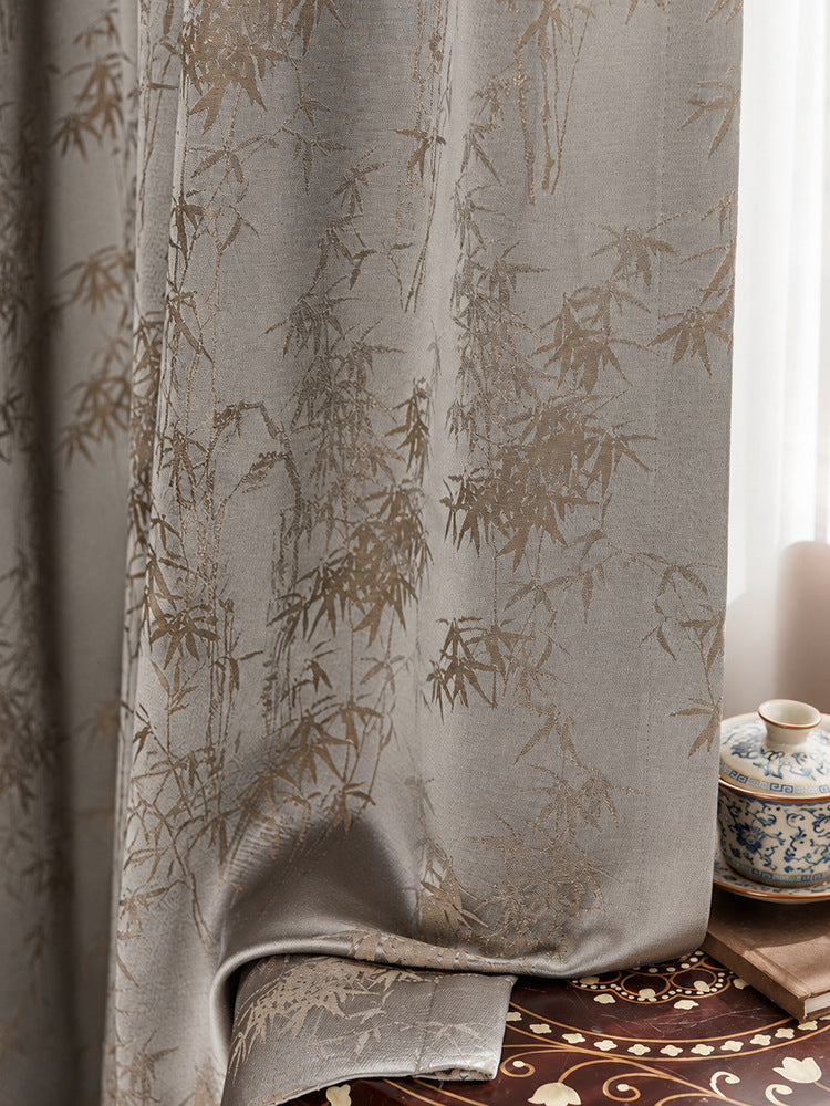
The photograph offers a useful starting point: gray-taupe curtain folds carry a slender, warm-toned bamboo design, while a blue-and-white lidded vessel sits on a wooden support at the side. The image suggests a way to combine different decorative surfaces. It does not establish the fabric's fiber content, care requirements, or light-control performance.
Start with the object you already enjoy
If you own a favorite vase, ginger jar, or painted bowl, begin there instead of buying an entire matching set. Identify its background color and its strongest decorative color. Then look for a curtain that relates to one of those colors without reproducing every detail. This gives the room a connection while allowing the ceramic piece to keep its character.
A blue-and-white vessel, for example, does not require blue curtains. A gray or taupe background can provide a quieter setting, especially when pale details elsewhere connect with the white glaze. Treat this as a visual comparison in your own room: the same combination may look different beside a warm wall, dark cabinet, or bright window.
Choose which pattern should lead
Curtains occupy a large vertical area; a ceramic accent usually occupies a smaller one. That difference matters more than whether both designs contain leaves or flowers. Decide whether the window treatment should make the first impression or act as a backdrop for the object. Letting one lead makes later choices easier.
When the ceramic is the focal point
Look for a curtain whose pattern has modest contrast at normal viewing distance. Stand where you usually enter or sit in the room and check whether the vase or jar remains distinct. A finely detailed curtain may read as a relatively calm surface from across the room, although a close photograph makes every line seem prominent.
When the curtains are the focal point
Keep the display smaller and simpler. One vessel with a clear silhouette often gives a patterned curtain more breathing room than a crowded shelf of decorative objects. You can still use a painted piece, but avoid surrounding it with several equally busy accessories that all ask for attention at once.
Vary motif scale and spacing
Two patterns can share a room without sharing the same scale. Fine branching lines on fabric can work with a more concentrated painted border on a jar because the shapes are organized differently. Compare the empty spaces as well as the motifs: an open curtain design and a densely decorated ceramic surface create a different balance from two tightly packed patterns.
Before ordering, place a fabric sample behind the actual object and view the pairing from a few everyday positions. A tiny sample cannot show the entire curtain repeat, so also use the product's broader views to understand distribution. For the distinction between woven pattern and surface appearance, see our guide to jacquard curtains.
Use plain surfaces as a pause
A plain wall, an uncomplicated tabletop, or a solid upholstered chair can separate the two patterns visually. You do not have to remove everything decorative. Start by clearing the immediate display area, then return objects one at a time. This makes it easier to notice when the arrangement has enough detail.
The photograph includes decoration on the surface below the curtain. That layered look may appeal to you, but it is optional. If your room already has a patterned rug or wallpaper, a simpler display surface can make the curtain and ceramic pairing easier to read. Build the arrangement around the room you have, rather than trying to reproduce every photographed element.
Keep decorative displays outside the curtain's path
Styling should still allow the window treatment to work. Set a vase or jar where opening and closing the panels will not pull fabric across it. Check the space with the curtains fully gathered as well as extended. A display that looks clear with the curtains closed may sit directly beside the stacked folds when you open them.
Use a stable surface and leave practical access for handling the curtain. If the only available spot makes the object difficult to reach or places it in the fabric's travel path, move the display elsewhere. The photograph is a composition, not an installation plan or a reason to arrange fabric around a fragile object.
Check the pairing in the room's changing light
Compare the actual ceramic and fabric together in daylight and under the lamps you normally use. Glazed surfaces can show bright reflections, while folds change which parts of the fabric face the light. Look at the overall relationship instead of trying to make every highlight match.
Our at-home fabric sample guide explains how to organize those comparisons. Use samples to judge appearance and feel; confirm construction, available options, and care information separately on the relevant product listing before ordering.
Common mistakes to avoid
- Matching every motif: repeated leaves on every surface can make individual pieces harder to appreciate. Repeat a color or mood instead.
- Choosing from close-ups alone: inspect broader curtain views and the room from your usual seating position.
- Adding accessories to solve a busy arrangement: first try removing an object or introducing a plain surface.
- Ignoring panel movement: test the full opening and closing path before settling on a display location.
- Inferring performance from the photograph: visible pattern and drape do not confirm blackout ability or material composition.
Once the arrangement feels balanced, explore the Luxvelum custom curtains collection and compare suitable options with your existing pieces. Aim for a coherent room in which the curtains and ceramics each have a clear role.
Frequently asked questions
Do my curtains need to match the color of my vase?
No. You can connect them through a background color, a small accent, or a similar level of visual warmth. Try the actual pieces together before deciding which relationship feels comfortable in your room.
Can I combine botanical curtains with geometric ceramic patterns?
Yes. Compare their scale, contrast, and spacing rather than requiring identical shapes. Let one pattern lead and use simpler surrounding surfaces if the combination feels crowded.
Should I place a decorative jar directly beside the curtain?
Only if it sits securely outside the fabric's full travel path and leaves comfortable access. A separate cabinet or shelf may provide a better display position.
What should I do if both patterns look too busy?
Reduce the number of nearby accessories first. Then try a quieter display surface or a curtain with less visible contrast. Recheck the arrangement from across the room before buying additional pieces.


