How to Choose Curtains for a Rust-Colored Accent Wall
For a rust-colored accent wall, start by comparing pale curtain fabrics against the actual wall, then check the curtain, trim, and any sheer layer together. A light neutral can give the strong wall color breathing room. A deeper curtain can create a more enveloping palette. Choose the relationship you want before searching for an exact color name.
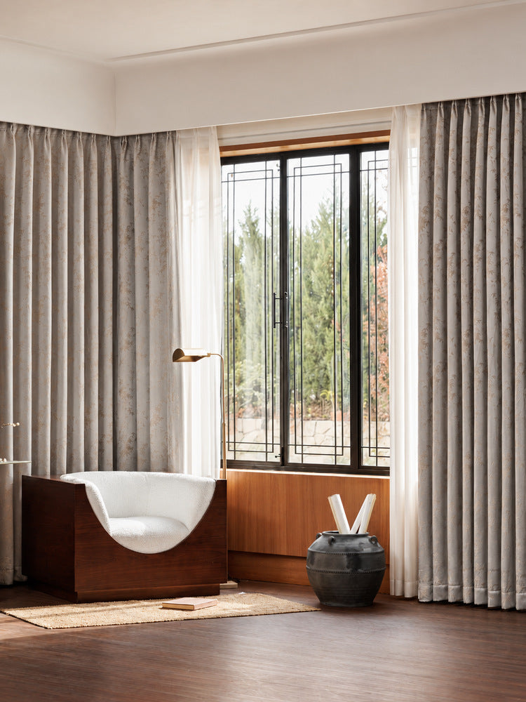
The featured photograph shows pale patterned curtains beside a textured rust-colored wall, white sheer fabric, dark wood furnishings, and a light upholstered seat. The curtain's fine botanical drawing adds detail without repeating the wall's strong color. This is a visual reference for balancing large colored surfaces; it does not establish the paint shade, fabric composition, or window treatment performance.
Decide whether the wall or the window should lead
A rust wall already contributes a substantial area of color. Before adding curtains, look from the room's entrance and decide whether you want that wall to remain the main feature. This decision is more useful than collecting unrelated curtain samples that happen to be described as beige, gray, or cream.
Keep the accent wall prominent
Compare light curtains with restrained pattern and plain surrounding upholstery. In the photograph, the pale fabric creates a different visual field beside the orange-brown wall. You can try this approach without matching every small accessory to the paint. Keep the largest surfaces in view while judging whether the contrast feels comfortable.
Give the window equal presence
Compare a stronger pattern or a deeper curtain color with the same wall. This is a different decorative choice, so test it deliberately rather than adding it after several other bold purchases. View the curtain both extended and gathered: a repeated design can appear quite different when its drawing is folded into a smaller area.
Compare warm and cool pale neutrals side by side
Rust-colored walls may sit beside curtains that read as creamy, sandy, taupe, or gray. Those labels are starting points rather than reliable matches. Hold the actual candidates beside your wall and ask what changes: does one look unexpectedly yellow, another pinkish, or another cooler than you wanted?
Do not choose the winner while each sample is in a different room. Put them in the same light and keep the floor visible. If the wall is already painted, work with it as a fixed finish. If you are also choosing paint, compare the fabric with the paint sample on the intended wall before committing to either purchase.
A pale curtain need not share the wall's warmth. You might prefer a cooler-looking fabric as a clear contrast. The useful test is whether you enjoy that combination beside your existing finishes, rather than whether a general decorating rule says the colors belong together.
Treat the white sheer as another color decision
The white sheer in the photograph is a large visible surface, not just an invisible extra layer. Compare the intended sheer with the main curtain, wall, ceiling, and trim. Two light fabrics can look harmonious separately but less convincing when they meet at the same window.
Place the samples beside one another rather than viewing the sheer only against the glass. Look at the combination with the main curtain open and closed. For the separate decisions about how two layers operate, see the guide to layering sheers and main curtains. Color coordination alone does not confirm privacy or light control.
Use pattern to connect the surfaces without copying the wall
The fine drawing on the photographed curtains provides a quieter kind of detail than the saturated wall. Try a subtle botanical, small geometric, or restrained woven-looking pattern if a completely plain panel feels too bare. Inspect the exact fabric rather than assuming that a pattern name predicts its scale or construction.
Keep the wall visible during the comparison. A motif that looks delicate in isolation may feel busier beside a textured wall, patterned rug, and decorative chair. If you already have several active surfaces, test a plain curtain as well. You can choose a quiet window treatment while still enjoying a colorful room.
Check the palette with the room in use
Use the actual seat, doorway, and lamps you live with. A fabric that works in a close-up sample arrangement may feel different across a broad window. Compare it in daylight and with your evening lighting, keeping the same neighboring surfaces in view each time.
- Identify the wall, flooring, trim, and largest furniture finishes that will stay.
- Compare a small selection of curtain samples directly beside the wall.
- Add the proposed sheer and check the two fabrics together.
- View the arrangement from the doorway and your usual seat.
- Repeat under your normal evening lamps before recording your preferred option.
The fabric sample evaluation guide offers a fuller comparison routine. Check the available options for Luxvelum curtain fabric swatches and confirm that a sample corresponds to the exact fabric and color you plan to order.
Common mistakes beside a strong accent wall
- Matching a screen image to a paint name. Use the photograph for inspiration and compare real materials in your room.
- Forgetting the sheer. Include every visible layer when judging the palette.
- Repeating rust in every accessory. Try the wall with your existing furnishings before adding more matching pieces.
- Choosing pattern only from a close-up. Review its appearance across the complete panel and from a normal viewing position.
- Assuming pale fabric means a particular function. Confirm composition, lining options, care, and light-control information for the selected product.
Once the color relationship is settled, browse the custom curtains collection and make the measurement, header, and ordering decisions separately. A successful palette is one part of a curtain plan; it does not determine the required dimensions or configuration.
Frequently asked questions
Do curtains have to match a rust-colored wall?
No. A pale neutral can create a distinct boundary, while a related deeper tone can make a closer palette. Compare the actual fabric and wall with your floor and furniture, then choose the relationship you prefer.
Can gray curtains work beside a warm accent wall?
They can be worth comparing. Check the specific gray in your room rather than treating all grays alike. A cooler-looking contrast may appeal to you, but it should also work with the trim, flooring, and other large finishes.
Should the sheer match the main curtain exactly?
An exact match is optional. View the fabrics together and check whether their difference looks intentional to you. Include your painted trim and ceiling in that comparison instead of choosing both fabrics separately.
Can I order the photographed color from this image alone?
Use the photograph as a styling reference. Confirm the current product, selected color, and available representative sample before ordering. Lighting and display differences make a styled photograph an incomplete basis for matching an existing wall.